KUEBIX Tracking Portal
UI/UX Design: Optimizing the TMS Shipping Experience

CONTEXT
What is Kuebix Tracking Portal
Kuebix TMS is my passion project. As someone fascinated by the potential of transportation management systems, I was drawn to Kuebix's innovative use of artificial intelligence to optimize shipping operations. What really motivates me is the chance to address a common pain point in the industry: tracking visibility. I believe Kuebix TMS can make a real difference by providing real-time visibility into shipments, and that's why I'm excited to work on this project.
Theme
End to end UX Design
Project management
Documents
Figma Link
Tools
FigmaOptimal Workshop
Time
2 week Research
1 week Design
OBJECTIVE
-
The user should have visibility of a clear system that can inform them of the status of their order at that given moment
-
The user should be informed well in advance if their order is going to be delayed.
-
The user should always expect their order to be delivered within the timeframe promised by the business.
For the Customers:
-
Reduce the number of customer complaints.
-
Reduce cost to the business. Dealing with customer complaints or inquiries can get expensive in the long run.
-
Automate order tracking systems. The fewer calls the customer care team receives, the more they can focus on other services.
For the Business:
01:EMPATHIZE
PRIMARY RESEARCH
Reviewing the www.kuebix.com
To accurately delineate the problem scope, I conducted research on Kuebix's website to collect pertinent information.

SECONDARY RESEARCH
Analyze the Comments
After reviewing Kuebix TMS on softwareadvice.com, I found that 56% of the negatives relate to interface issues and 30% to tracking visibility problems.
.png)
Comprehensive Review and User Insights
After reviewing the Kuebix website and user feedback on softwareadvice.com, I discovered that while Kuebix TMS offers advanced shipment features such as managing payments and optimizing pricing, it also has significant challenges. Notably, 56% of user criticisms involve interface issues, and 30% relate to tracking visibility problems, highlighting concerns over its cluttered interface and unreliable tracking system. Addressing these issues by streamlining the interface and enhancing tracking reliability is crucial for improving user satisfaction and fully leveraging the benefits Kuebix promises, especially its touted complete shipment visibility.
OVERCOME THE CHALLENGE
Getting Rejected from Requesting a Demo from Kuebix TMS
To fully understand the software's user flow, I requested a demo of Kuebix TMS from SoftwareConnect. During my call with their software expert, I expressed my intention to create a case study based on their design challenge. However, despite my request for a demo, he suggested that I check out the free resources available on their website and declined my demo request.

Alternative Solution
Exploring Kuebix: Beyond the Official Product Details
After facing the initial setback, I realized that the product details on Kuebix's website were insufficient for my needs. Undeterred, I resorted to searching for additional information on YouTube and other online resources. Through diligent effort, I was fortunate enough to uncover some valuable screenshots of the product and review the userflow from a variety of sources.
.jpg)
Secondary research reveals that the software, packed with functions, is overwhelming and not user-friendly for newcomers, with reviews on softwareadvice.com indicating new shippers struggle with navigation and scattered information.
IA ASSESSMENT
Reviewing the Product Screen
Via an assessment of their current site Information Architecture, I identified three key causes of concern:

Information missing
Critical shipping information is unseen. No shipping estimated arriving date, no order status.
In consistent design
The design of font and buttons are inconsistent, which decreased the trust of the business.
Hard to navigate
The order tracking screen offers too many functions and buttons that not been used by regular shipper.
Comparing Kuebix TMS with 7 Similar Products
Market reviews reveal that Kuebix TMS primarily serves business owners (89% of users), supports only English, and uniquely offers instant access to direct carrier rates, distinguishing it from competitors. However, after comparing it with seven other transportation software solutions, I found that Kuebix TMS lacks key features such as real-time monitoring, real-time data comparison, and status tracking, which are available in competing products.


02:IDEATE
Using SWOT Analysis to Highlight Areas of Improvement.
Here are the key findings from the SWOT analysis conducted based on the research:
-
Kuebix TMS boasts a wide range of features, giving it a competitive edge in the market.
-
However, the platform faces a significant challenge in terms of tracking visibility, which can potentially hinder user experience and customer satisfaction.
.jpg)
Learning from the Users
To better understand our users, I analyzed 20 client reviews, identifying patterns in their use of transportation management software. Insights from these reviews highlighted common needs such as pricing options, interface usability, customer support, and system reviews. Notably, users' familiarity with transportation systems significantly influenced their behaviors. These findings led to the creation of two personas to steer my design process.


How may we create a product that provides both Sam and Natasha with better visibility, easier to navigate, and time-saving?
03:DEFINE
USER TESTING
Building Information Architecture
14 participants in total | 6 in-person | 8 online (tool: Optimal Workshop)
In-person and online card sorting provided insights into our shipment tracking portal’s information architecture, revealing that core content like shipment options forms a cohesive group, while dynamic details like shipment status and tracking can be effectively distributed across multiple access points.


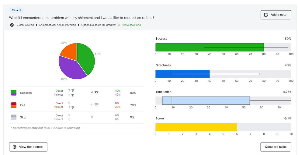
TMS Portal Scores 88% in Information Structure Success
11 participants in total | 6 in-person | 5 online (tool: Optimal Workshop)
Tree testing enabled me to gather crucial feedback on refining the information architecture for our shipment tracking portal, providing clear insights into user preferences. This method allowed me to engage a larger, less biased sample, revealing that content such as shipment options clusters together, whereas shipment status, delivery updates, and location tracking can be effectively positioned in multiple locations for better accessibility.

PORTAL STRUCTURE
Version 1.0 & Version 2.0


Image above is my ideation process

The user flows and information architecture were interdependent and were developed simultaneously. I wanted to streamline the information architecture, create a structure that enabled a consistent experience no matter what insurance type the user is looking for, and a structure that allowed room for the content to grow.
04: DESIGN
LOW- FIDELITY
Low - Fidelity Prototype and Early Usability Testing
7 participants in total | 0 in-person | 7 online (tool: Screenshare)
I started with brainstorming ideation on paper, and then I quickly put together the basic structure of the dashboard that included all the critical functions. I conduct an online screening test with 7 participants (4 familiar with the shipping system, and 3 that are not, ages 20-40) After ideas were validated, I started to push further on the directions shippers preferred.

Key Insights from Usability Testing
After usability testing, I realized users actually responded most to numbers and live data. This shifted my priorities to focus on building an information architecture that is data driven.
LITERATURE REVIEW
Learning the Best Practices & UI Patterns
As I was designing this portal from the sketch, it was critical to learn best practices for dashboards & tables. I researched many case studies and expert articles about card designs, condensing columns, accessible color choices, appropriate cell sizes, and more. This ensured I leveraged existing patterns to make an intuitive interface.


Refactoring UI taught me to make status pills visually accessible to all readers while still using reds & greens.


Muzli helped me discover & validate card patterns with mentors. They aligned most with the above card pattern as it gave most context.
VIRTUAL DIRECTION
Building the Design System for Tracking Portal
Before this project, I already had existing design system and visual design guidelines. However, this project had many new parts and would be scaled in the future. Hence, I added new components to our design system which I would then consistently use in the final build of the dashboard.

How the solution solves the needs of Natasha (Persona 2),
who was not familiar with transportation system?
05: LAUNNCH
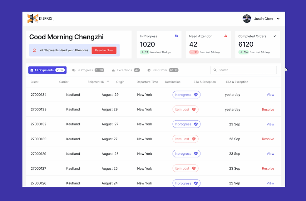
The Final Look of the Product
Introducing our finalized order tracking portal design, meticulously crafted for an elevated user experience. With its intuitive layout and streamlined navigation, users can effortlessly track orders. This design embodies our commitment to user-centricity and functionality.

MULTIPLE TABS & VIEWS
Easily TRACK the Right Data
With the incorporation of three distinct tables representing various phases of the shipment process - 'in-progress', 'exception', and 'all shipments' - shippers are now able to effortlessly monitor the status of their shipments, promoting greater transparency and accountability throughout the logistics chain.

SEARCH
MAKING Search Query
To facilitate streamlined data input and reduce user effort, the system assists shippers in quickly and accurately indicating relevant information.
EXCEPTION DIALOG
NOTIFYING the exception
The system empowers users to promptly respond to shipments that require immediate attention, enabling them to take swift and decisive action to rectify any issues that may arise.

LIVE TRACKING
SECURE your shipment with Live-Tracking
By leveraging the order detail page, users can access real-time data and obtain the most up-to-date information pertaining to their shipments, thus enabling them to make informed decisions based on the latest data available.

06: RESULTS
Kuebix, a Trimble Company, Offered Me a Job
After completing my case study, I reached out to Kuebix to share my findings with them. My work was well-received, and I was extended an invitation to discuss potential job opportunities. However, I politely declined the offer, as I had other career prospects that were better aligned with my personal and professional goals at the time.
Professional Feedback on My Work

Heigy Peguero
The Lead Designer of Appetizer Mobile
As a senior designer, I am truly impressed with your project on the Kuebix transportation management system. Your ability to effectively translate your ideas into tangible designs exemplifies your proficiency as a skilled UX designer. I have no doubt that your exceptional talent and dedication will lead to continued success in your future endeavors."
Zoshua Colah
Sr. Product Designer
As your mentor, I am honored to say that your project on the Kuebix transportation management system showcases a high level of skill and proficiency.

Key Areas to Enhance
-
The absence of an 'edit order' feature in the Kuebix portal is a potential area for future improvement. Incorporating this function into the product could enhance its overall usability and convenience for users.
-
To further enhance the functionality and utility of the Kuebix portal, future iterations may consider incorporating additional functions from the original software.
What I Have Learned
-
Throughout the duration of this project, I have gained valuable experience in using Figma to streamline my design process and establish an efficient design system.
-
I acquired the skills necessary to conduct thorough competitive research for the product
-
I employ tree testing and card sorting methods to ensure optimal usability.