
Chiropractic Landing Page
A Comprehensive Approach to Building Heron Chiropractic Center's Website
OVERVIEW
"Who is Dr. Bob Heron?"
Dr. Bob Heron is a highly trained Chiropractic Kinesiologist with a focus on treating the whole body. His son approached me to help create a landing page website to increase his client base. Using a comprehensive approach to web design, I developed a visually appealing and informative website that accurately reflects Dr. Heron's unique skills and services.
How I land on the project
While collaborating with Chris Heron on a dashboard project at a digital agency, he was impressed by my attention to detail, comprehensive skillset, and effective project management. He subsequently approached me to create a website for his father, Dr. Bob Heron, a highly skilled Chiropractic Kinesiologist who specializes in complex cases.
Theme
End to end UX Design
Project management
Documents
HeronChiropractic Landing Page
Tools
Figma
Optimal Workshop
Squarespace
Time
2 week Research
1 week Design
Myself
OBJECTIVE
-
Increase online visibility and awareness of Dr. Bob Heron's unique skills and services as a Chiropractic Kinesiologist
-
Provide a platform to showcase Dr. Heron's expertise and experience in treating complex cases
-
Establish credibility and build trust with potential clients by highlighting Dr. Heron's diagnostic methods, techniques, and research
For the Client:
-
Inform and educate potential clients about the benefits of Chiropractic Kinesiology and how it can help with their specific health issues
-
Provide easy access to important information about Dr. Bob Heron's services, including his areas of expertise, diagnostic methods, and treatment techniques
-
Encourage potential clients to schedule an appointment or contact Dr. Heron for more information about his services.
Target audience
Design Process

01:EMPATHIZE
CHALLENGES
Lack of First Handed Information.
Regrettably, the following information could not be obtained from Chris Heron:
-
Visual aids such as videos or images pertaining to the stakeholder.
-
Sufficiently detailed information regarding the services offered.
-
Adequate testimonials to corroborate the stakeholder's expertise and reliability.
-
Reviews from patients to provide insight into the stakeholder's performance and effectiveness."
Not able to Communicate with
Skateholder Directly.
Throughout the design process, I encountered difficulties in establishing direct communication with Dr. Bob Heron in order to obtain valuable information and insights regarding his services.
Chris Heron is encountering difficulties in obtaining the required information from his father to facilitate the creation of the website, which can be frustrating given the limitations imposed by this constraint.
PRIMARY RESEARCH
Interview with Stakeholder's Son
During the process of conducting critical research for the Chiropractic website, I had communicated with Chris Heron back and forth to get critical information about the service of the business. The image below is where I was having Zoom interview with Chris

SECONDARY RESEARCH
Reviewing the Past Client Information.
I reviewed past client documents in order to gain a better understanding of their behavior and needs in regard to the services provided by Dr. Bob Heron.


During the design process, I reviewed the personal histories of several patients who had received treatment from Dr. Bob Heron to gain a better understanding of their experiences and needs. This information helped to inform the design and messaging of the website, ensuring that it effectively communicates the unique value proposition of Dr. Heron's chiropractic services to prospective clients.
MARKETING RESEARCH
Standing out among 762 Chiropractic Medical Practitioners in Costa Mesa and Las Vegas is crucial.
Despite the benefits that come with having numerous chiropractic options available to potential customers, my client, Heron Chiropractic Center, faced a significant challenge due to the abundance of competitors within a 50-mile radius of their two locations in Costa Mesa and Las Vegas. To overcome this challenge, it was crucial to develop a strategy that enabled them to stand out in the crowded market.

DESIGN RESEARCH
Old Website Oveview
As part of the initial phase of the project, I conducted a thorough review of Heron Chiropractic Center's existing website. My goal was to identify any issues or pain points that were preventing the website from effectively reaching and engaging with its target audience. I analyzed the website's layout, design, and user experience, paying close attention to factors such as site speed, navigation, content organization, and visual appeal. By gathering these pain points, I was able to develop a clear understanding of what needed to be improved in order to optimize the website for conversions and increase overall user engagement.

Summary
The website could benefit from additional visual content, more information about Dr. Bob Heron's approach, improved mobile responsiveness, better navigation, and testimonials from previous clients to build trust.
COMPETITOR RESEARCH
Exploring the Competition to Gain a Strategic Edge.
With the goal of developing a professional and effective website for Dr. Bob Heron's chiropractic practice, I have undertaken a comprehensive competitive research effort. Through this research, I am seeking to gain a deeper understanding of other chiropractic websites and the strategies they use to attract patients, convey their expertise, and build their online reputation.


02:IDEATE
How do We Improve our Landing Page and Conversion Funnel to Boost Scheduled Appointments on Our Website?
When individuals search for new healthcare providers without any referrals, they tend to start their search geographically by looking for clinics in convenient locations. From there, they use filters such as reviews, ratings, and photos to refine their choices before visiting a clinic's website.
Hence, I embarked on the following objectives:
-
Recreate the current website with the aim of increasing the total number of appointments and consultations scheduled by first-time visitors.
-
Build a strong digital presence on prominent platforms such as Yelp, Google, and medical websites to establish trust with potential customers and guide them to our website through an optimized conversion process.
DESIGN STRATEGIC
Using SWOT Analysis to Highlight Areas of Improvement.
Hence, I embarked on the following objectives:
-
The current website fails to effectively showcase the business's strengths.
-
Implementing the addition of professional photos of the clinic, services, and digital presence is crucial to enhance trust and enhance the business's reputation.

LEARNING FROM THE USER
Chiropractic familiarity and Financial Factors Drove Clinic Selection.
I conducted user interviews with a stakeholder's son and 5 potential customers, uncovering common factors influencing user behavior such as location, operating hours, reviews, ratings, finances, and prior experience with chiropractic, leading to the creation of two user personas to guide my design process.

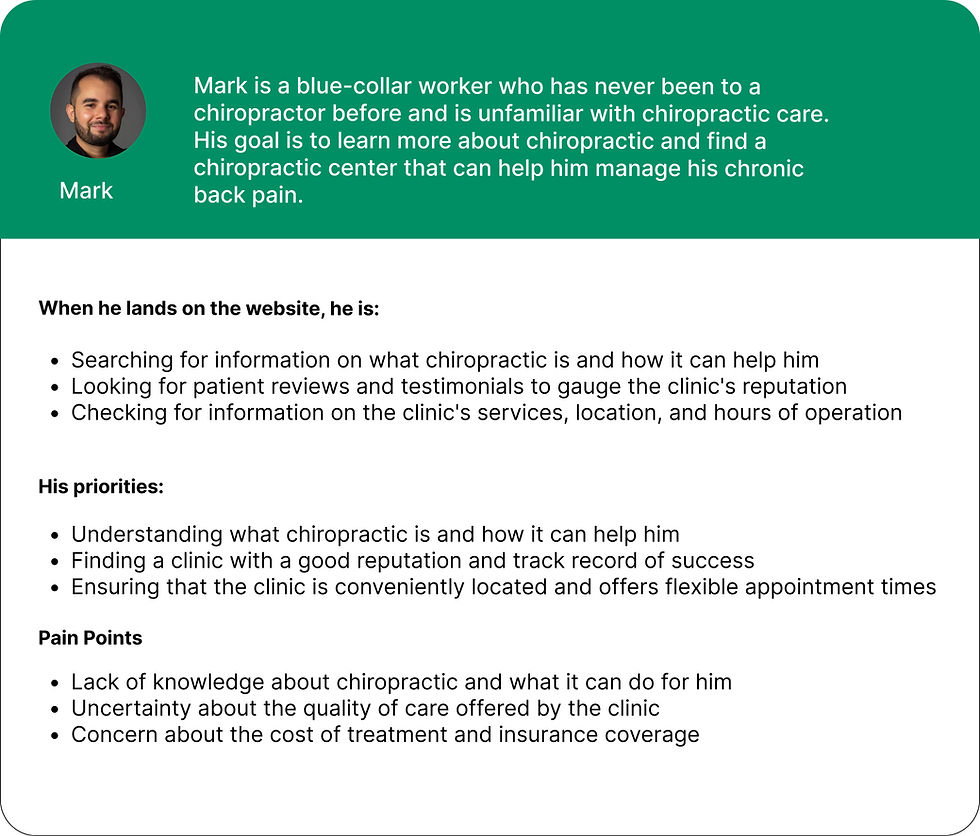
How can we improve the website experience for both Mark and Rachel to help them achieve their goals and find the chiropractic care they need?
03:DEFINE
CONVERSION STRATEGIC
Improving our conversion process is crucial for converting potential customers into actual ones.
In order to maximize the impacts of our website redesign, I identified multiple opportunities to retain potential customers in the funnel from the beginning to the end. I set out a strategic plan (see image below) between the stakeholder and myself.

HEURISTIC EVALUATION
84% of the useful information is absent on the current site.
By conducting a content inventory, audit, and gap analysis, I identified that 16 common user tasks were not effectively supported by the existing content on the site. I found that 84% of the content critical to helping visitors make informed decisions was missing, presenting a significant challenge for the website.

IA ASSESSMENT
The current website received an average rating of 1.3 out of 10 for overall satisfaction on a 1-10 scale.
On a 1-10 satisfaction scale, with 1 indicating "not satisfied at all" and 10 indicating "very satisfied," the results align with my findings from the information architecture assessment. Several users also provided feedback, stating:

"Confusing, unable to find desired information."
- Shashiba S.
"In my opinion, this person lacks a professional appearance."
- Micheal L.
"The information gives me the impression that
it is outdated and not current."
Jason H.
My Next Step
My aim is to create an informative and user-centered information architecture that satisfies both business requirements and the user's expectations.

CARD SORTING
Building Information Architecture.
12 participants in total | 4 in-person | 8 online (tool: Optimal Workshop)
I utilized in-person and online card sorting to gather insights on improving the information architecture. In-person sorting gave me personalized feedback and context, while online sorting provided a larger sample and reduced bias. The results showed that services were strongly grouped together, while content like success stories and call-to-action could be accessible from multiple locations


TREE TESTING
The revised IA Achieved an average Success Rate of 100%
11 participants in total | 7 in-person | 4 online (tool: Optimal Workshop)
Before conducting tree testing, I used the four metrics - specificity, conciseness, familiarity, front-loaded - to measure the effectiveness of labels of the sitemap.
I modified the labels by leveraging the learnings from competitors’ websites and labels users created during card sorting.

Version 1.0 & Version 2.0
SITEMAP


The userflows and information architecture were interdependent and were developed simultaneously. I wanted to streamline the information architecture, create a structure that enabled a consistent experience and a structure that allowed room for the content to grow.
04: DESIGN
USABILITY TESTING
Low- Fidelity Prototype and Early Usability Testing
5 participants in total | 0 in-person | 5 online (tool: Screenshare)
I began the process by jotting down ideations through brainstorming, then rapidly transforming a few concepts into wireframes to present to clients and users. After obtaining validation on the ideas, I progressed in developing the preferred direction as indicated by client and users.

Key Insights from usability testing
Following the usability testing, it became evident that users had the strongest engagement with personalized content regarding the clinic. This led us to adjust our priorities and concentrate on enhancing the website's branding efforts. To maintain a clean and straightforward approach, I kept the information architecture simple, with the option to refine it further in future design sprints if necessary.
LOGO DESIGN
Creating a Striking Logo Design
Through extensive research and a keen eye for detail, I crafted a unique logo and color scheme that aligns with the chiropractic industry's values, mission, and latest design trends, evoking trust and reliability while effectively communicating our brand's message to our target audience and enhancing the website's professional appeal.
Drawing Inspiration from Intricate Spine Drawings to Create Minimalist Logo
I draw inspiration from intricate spine drawings, carefully mimicking their curves and shapes to create minimalist yet impactful logo designs that convey the message in a visually compelling way.

Sketching

Mood board

Final Result
COLOR THEME
Picking the Unique Color theme
I selected the combination of white (#FFFFFF), light blue (#8EB6DC), and bright blue (#3778FA) for the chiropractic website design to enhance the user experience. This color palette conveys professionalism, calmness, and clarity, thereby building credibility and trust with potential patients. The neutral base of white (#FFFFFF) balances the visual elements, while the light blue (#8EB6DC) and bright blue (#3778FA) combination creates a clean and fresh look, making information easily accessible.

REFINEMENT
Crafting Exceptional Designs Through a Process of Continuous Refinement and Innovation
"To create exceptional designs, I constantly refine and iterate until I reach the ideal version. This process can be challenging, requiring tough decisions like removing a pixelated stakeholder's profile picture from the homepage. However, it's all worth it in the end when each element of the design comes together to create an impactful whole."

Version 4.0

Version 5.0
DESIGN CHALLENGE
How to Solve the Needs of Mark(Persona 1), Who was not Familiar with Chiropractic ?
To help those unfamiliar with chiropractic care, we prioritize the 'conditions we are experts in' section on our homepage. By providing a clear overview of the conditions we treat, we help potential patients like Mark understand if we can help them with their specific needs, build trust and credibility, and help them feel confident in their decision to choose our practice.

New website architecture
Homepage Redesign | Solving Mack’s question, “how it can help me?”

Enhancing the User Experience through Additional Pages Who was not Familiar with Chiropractic ?
To enhance the user experience, I added new pages to the chiropractic website design project, such as a services page, an about page, and a contact page. These pages provide visitors with more information about our practice, making it easier for them to learn about our services and schedule appointments. By adding these pages, we can improve the user experience and help visitors feel more comfortable and informed about our practice.


Testing
“This is exactly what I am looking for!”
“I came to look for one thing, now the website hooked me up and I wanted to read more.”
After adopting the change and having three iterations, I tested the idea with 5 users, and the feedback was extremely positive.
05: LAUNCH
WEBSITE BUILD
Choosing Squarespace to build the website
Squarespace simplifies the process of bringing mockups to life without the need for a front-end developer or subpar DIY software. With Squarespace, websites can be easily built and updated through a visual coding process. Squarespace bridges the gap between DIY software like Wix, traditional CMS like WordPress, and front-end web development, offering a user-friendly solution for website creation.
Gianing Stakeholder Buy-in
After thorough online research and discussions with my technical friends, I presented my findings to Chris and successfully convinced him to use Squarespace.
I dedicated a day to learning through Squarespace's educational resources and was able to build the website within one weeks, while ensuring fast loading speeds for optimal user experience.
Responsive Design
Our chiropractic website has a fully responsive design that works seamlessly on both desktop and mobile devices. Whether you're browsing on a large screen or a small one, you can easily navigate through our site, access important information, and schedule appointments.


Eliminate questions
Previous research revealed a lack of crucial information which was addressed by incorporating and prominently showcasing the information along with the strengths of the business derived from a SWOT analysis, to build trust with visitors.

Digestible Information, Engage to Learn More
For people with little familiarity with Chiropractic, How the business can meet people’s needs was a clear issue in the past. I addressed this by creating a conditions treated section and prioritized it.
This approach resonated with users’ needs and gained 100% thumb-up.

Clear Call-to-Action, Make Appointments Easily
Previous research revealed a lack of crucial information which was addressed by incorporating and prominently showcasing the information along with the strengths of the business derived from a SWOT analysis, to build trust with visitors.

06: RESULT
AVG SATISFACTION SCORE
Increased 523%
The score boosted to 8.2 from 1.3 on a 1-10 scale. Result came from a survey with five users.
CUSTOMER TRUST
Scored 7
Measured on a 1-10 scale. Data came from a survey with five users.
Overall, I Felt Super Proud of this Win. Here is what Chris, the Son of Stakeholder, said.
"To cater to the needs of individuals with limited chiropractic understanding, I addressed a key issue by creating a prioritized section on treated conditions. This solution resonated with users and received unanimous approval, demonstrating its effectiveness in meeting their needs."
-By Chris Heron, the son of the business owner
REFLECTION
Enhance Content Readability
-
During user testing, half of the participants pointed out the issue of content readability.
-
I will work on improving it to provide a better experience for users.
Improve mobile responsiveness
-
With the growing usage of mobile devices for browsing, it's essential to optimize the mobile experience.
-
I will focus on enhancing the responsive design for better usability on smaller screens.
What I have Learned
Client Engagement
It's crucial to keep Client involved in the design process from the early stages. Their "no" feedback is equally important as "yes" and helps save time and steer the project in the right direction.
Client Education
I spent time educating the Client about design philosophy and this helped in building their trust and support for the project.
Over-Communication
Regular updates on the project's progress and improvements can build confidence and trust with the client.